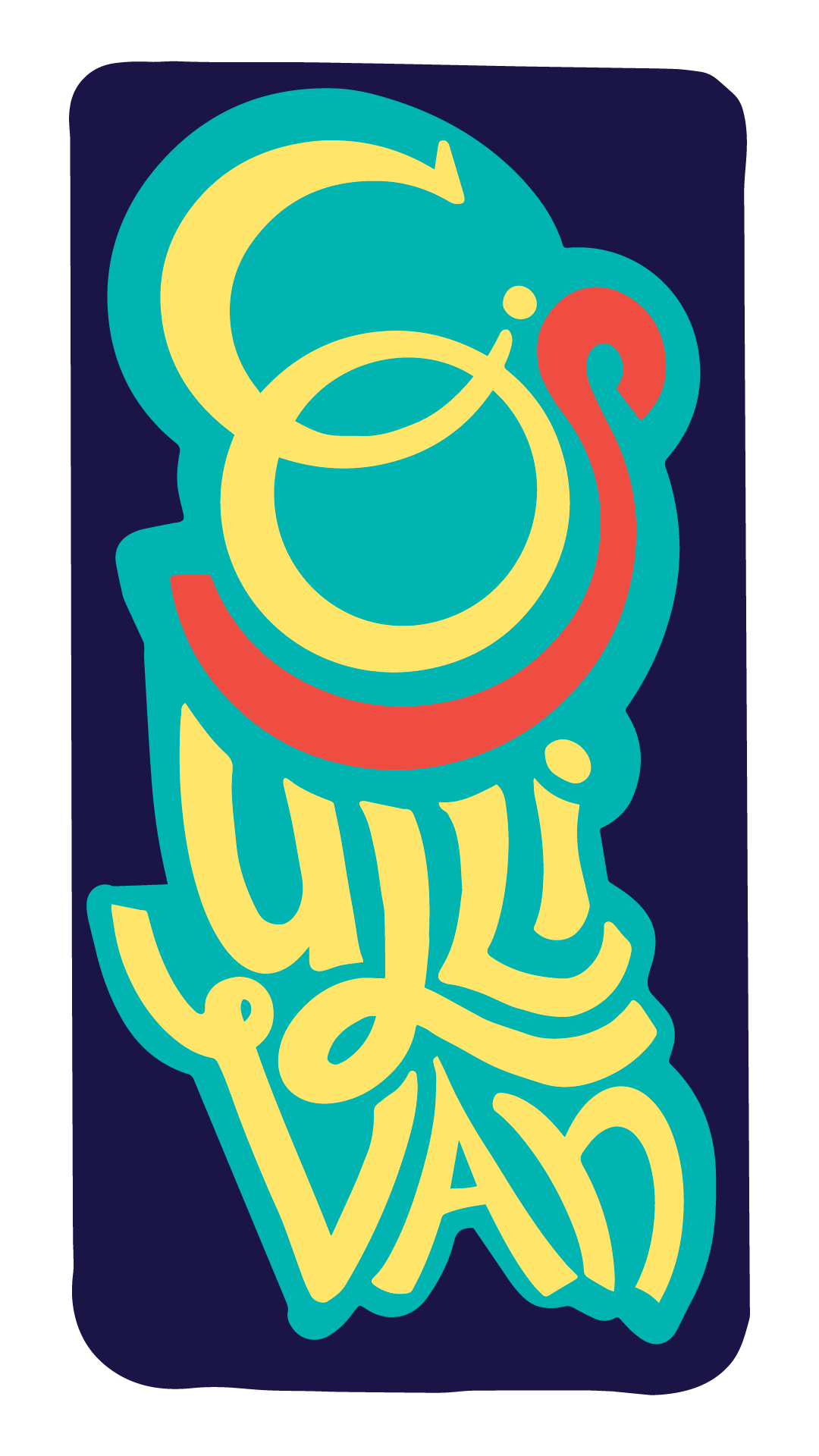

Logo design // Primary Lockup Full Color
This is represented in professional letterheads and print assets. This is the version of the logo in its entirety. Ink and Quill Publications uses this mark for their most official print assets.
Iterations
It’s rare that a logo design is perfect the first time around. I’m still waiting for that magical moment. In the meantime, I’ve developed a process that works well to be able to communicate clearly with my clients and figure out their needs. I can take feedback and direction and come to a solution that they are happy with with the tools I’ve learned along the way.


How We Broke Down Color
This is the color swatch I was given they had found somewhere in the wildland of the interweb. I printed the sample, grabbed a Pantone book, and matched spot colors, from there I broke down RGB, CMYK, and HEX so they can communicate with whoever they choose to print assets with.
Custom Wordmark Inverted
When space is an issue the wordmark can be used on its own. It is inspired by typography created by a typewriter. Each letterform feels like it’s stamped out onto a sheet of paper.


Ink and Quill Publications just launched! It is the brainchild of two women who wanted to represent artists. They came to me wanting an original logo, custom wordmark, and full lockup. They wanted to be able to represent themselves across social platforms, their website, and any print publications they might have.

Social Representation
As ink and quill publications grow as a business they have a subtle iconic logo they use to stamp at the bottom of their posts.
Logo & Custom Wordmark

Primary Full Color Lockup
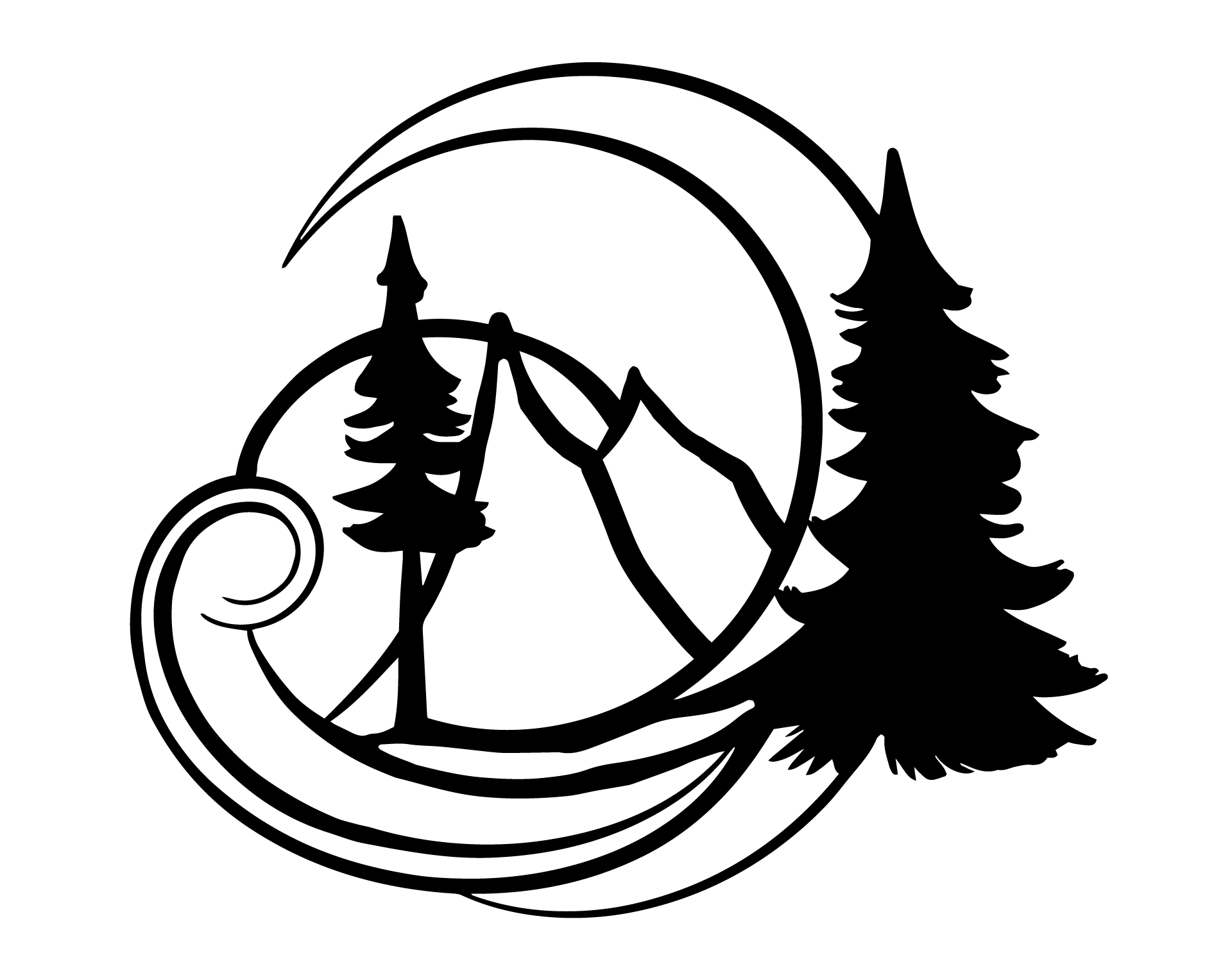
Aaron Wagoner is a Seattle-based Photographer/Videographer. He came to me with some references he liked for logos but wanted something unique to his brand.
Secondary Full Color Lockup
The end solution ended up being a custom wordmark, custom logo, watermark, organized file format samples, and spot color selection.

Process: Iterations & Scalability
Part of the process for solutions for Aaron was to figure out how certain marks scaled it makes it easier to whittle down options.
Finding Solutions.

Primary Logo
This design was inspired by nature, a major focus of this photographer’s work. The sunburst is a reference to an aperture. I wanted to make a logo for a photographer that didn’t have to be a camera.

Custom Wordmark
The individual letterforms have subtle differences making it feel strong and handcrafted.
Secondary Logo
The secondary logo isn’t a simplified version of the primary, it’s an opportunity for this person to be able to mark projects that might be more personal—or outside of their professional work.