For the Love of Pizza.
DISCIPLINES: Logo exploration, logo design, branding design, signage, web design, advertising
SKILLS: Communication, adaptability, client collaboration
SOFTWARE: Photoshop, Illustrator, InDesign, Procreate, Squarespace, Google Ads
CLIENT: Tacoma Pie
Tacoma Pie is a takeout, Detroit style, pizza place operating four days a week in Tacoma, Washington. This startup launched in response to losing long time employment with another restaurant during the COVID-19 pandemic. They are operating within a commissary kitchen with pickup options, with limited hours. This has presented unique positioning and workarounds. Tacoma Pie needed a logo and branding system that set them apart from the competition. Their style and integrity of their product needed to be represented in the same fashion as their design system.

Some things that they wanted to be represented by logo and brand were:
They liked “cartoony,” playful, youthful. Things that reminded them of going to pizza with their families when they were young and got to run around after.
They had picked typography for the menu and were attached to it.

Tacoma Pie’s happy greeter

Full Color Lockup
The character is loosely based on the owner and is meant to feel as playful and fun as he is.
Finding responsive solutions.
We needed to make sure the site translated well for mobil, that it was easy to navigate, and gave our users a feel for Tacoma Pie especially because they were new comers in a city full of choices.
Considerations to address:
Since they were operating out of a commissary kitchen they needed signage that would pop for people driving by looking for a pickup location.
They needed a website with easy navigation and the ability for them to update on their own for menu changes, adding pictures, announcements, etc.
Discovering Client Goals
The ultimate goal for Tacoma Pie was to be able to maintain their website on their own. They wanted to be able to update menu items and add pictures. We worked together to photograph their journey as they started their take-out orders. Then I brought everything into Photoshop and formatted photos to be able to load quickly and make their product shine. I got so hungry doing it, but they ended with something authentic.
Signage

Tacoma Pie has a brick and mortar store now! Super excited to have made their signage. Their mascot is so happy. Go check them out on 6th Ave in Tacoma, WA. They even have a bocce court out on their patio.


Packaging Design
For the box design, there is a chance for advertising, it was important to put the website and phone number on the box for those occasions when people bring food over to others or events, we also wanted to leave space to mark down someone’s name and time the pie was fresh out of the oven.
Tacoma Pie seals their pies with reheat instructions, our solution is to be able to print these at a small cost and easily, it adds a little more flavor to every order.

Uniform Design
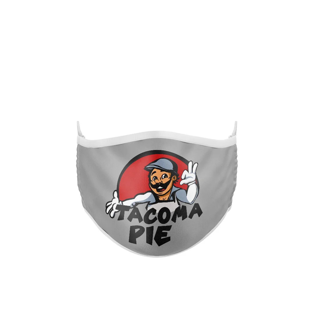
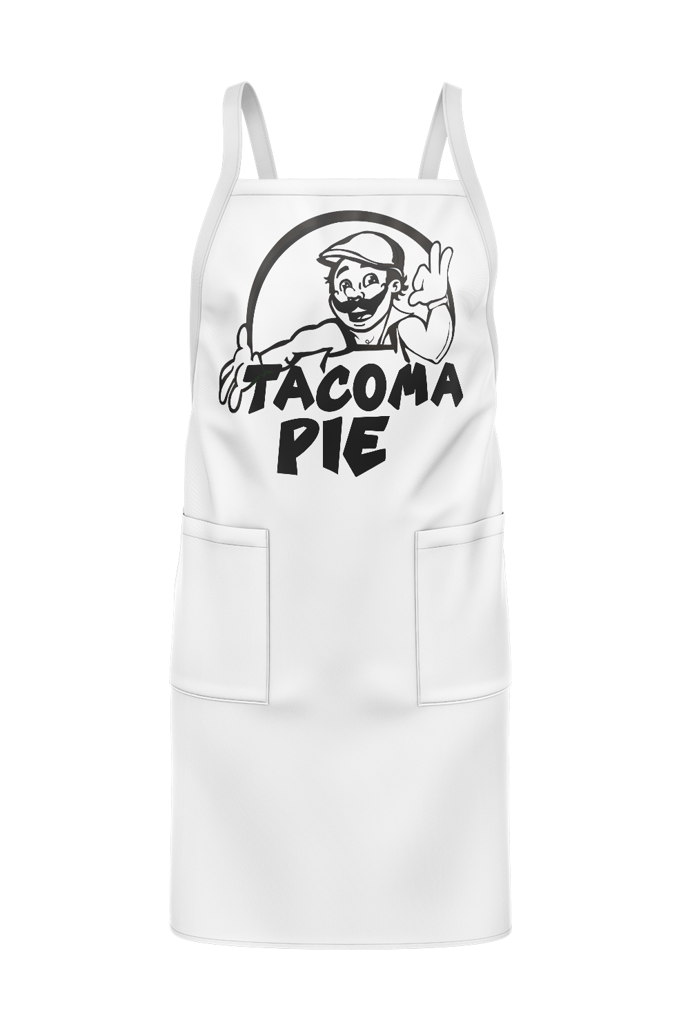
All of the apparel pieces for Tacoma Pie have options for straight black, full color, or inverse printing. This turned out to be a great option for them to be able to save money on assets they had to print a lot, as well as offer single color screen printing options.
Sticking to our goals of remaining playful, and friendly Tacoma Pie’s business cards are meant to feel like a happy greeting from someone who knows good pizza.

Please enjoy viewing some of the iterations that didn’t quite make the cut.


